The United Kingdom is home to some of the world’s most innovative and influential design agencies. From globally recognised branding studios in London to fast-growing digital specialists in Kent, every county brings its own creative energy and industry strengths.
In this blog, we explore 10 top design agencies across key UK counties and cities, including London, Birmingham, Manchester, Glasgow, Leeds, Liverpool, Edinburgh, Bristol, Newcastle, and Kent. Each section highlights a leading agency, its website, services, and an expanded overview of what makes it stand out in its local market.
Whether you’re looking for branding, UX/UI design, web development, or a full digital transformation partner, this guide will help you identify the right creative agency in your region.
Founded in 2004, DCP Web Designers is a full-service digital agency delivering web design, eCommerce development, branding, and SEO services. With nearly two decades of experience, they have built a reputation for reliability and creativity.
What Makes London’s Design Scene Unique
London is the UK’s creative capital, home to global brands, startups, fintech companies, and luxury retailers. Agencies here must compete on international standards delivering high-end UX design, advanced development, and cutting-edge branding.
Services Offered
Custom Web Design
WordPress & eCommerce Development
Branding & Graphic Design
SEO & Digital Marketing
Ongoing Website Support
DCP focuses on creating conversion-driven websites while maintaining strong visual identity and user experience standards.
ALT Agency is an award-winning digital agency specialising in performance-focused web design and CRO (conversion rate optimisation). They have built a strong reputation across the Midlands for measurable business growth strategies.
Birmingham’s Creative Landscape
As the UK’s second-largest city, Birmingham is a hub for manufacturing, finance, and professional services. Agencies here focus on ROI-driven digital solutions and scalable business websites.
Services Offered
Custom Web Design & Development
eCommerce Development
CRO & UX Optimisation
SEO Strategy
Digital Growth Consulting
ALT Agency emphasises data-backed design and continuous performance improvement.
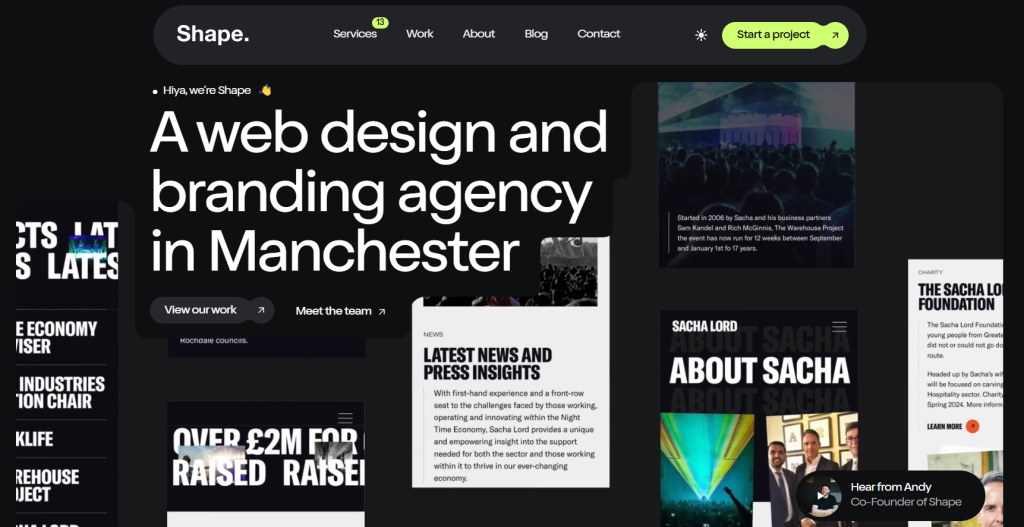
MadeByShape is a creative branding and web design studio known for bespoke digital experiences. Established in 2010, they work with startups, SMEs, and global brands.
Manchester’s Digital Growth
Manchester is one of the fastest-growing tech hubs in the UK. With MediaCity and a strong startup ecosystem, agencies in this region thrive on innovation and bold design thinking.
Services Offered
Brand Identity Design
Web Design & Development
eCommerce Solutions
Digital Marketing
UX/UI Strategy
MadeByShape is recognised for clean, modern designs that blend creativity with usability.
Parachute is a Glasgow-based digital agency delivering website design, development, and hosting solutions. With over 20 years of experience, they serve SMEs and public sector clients.
Glasgow’s Design Market
Glasgow combines creative industries with public sector institutions and education. Agencies here focus on accessibility, functionality, and long-term digital partnerships.
Splitpixel specialises in accessibility-first WordPress development and brand strategy. They work with arts organisations, nonprofits, and commercial brands.
Leeds Creative Industry
Leeds has a thriving financial and legal sector, alongside a strong creative community. Agencies in this county focus on compliance, accessibility, and performance.
Urban River is a full-service digital agency working with public sector bodies, charities, and large organisations.
Newcastle’s Digital Ecosystem
Newcastle boasts a robust public sector presence and a thriving digital startup ecosystem.
Services Offered
Web Design & Development
Branding
Digital Strategy
Long-Term Support Partnerships
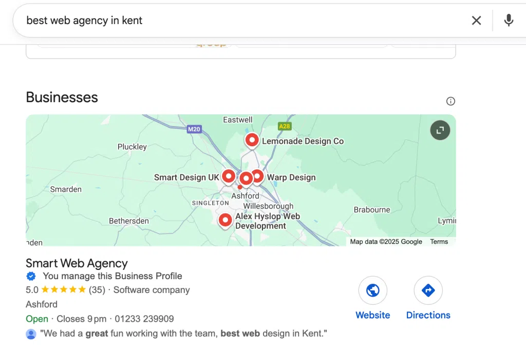
10. Kent – Smart Web Agency (Ashford)
About the Agency
Smart Web Agency is a multidisciplinary digital partner offering custom web design, software development, automation systems, and digital marketing services.
Kent’s Business Environment
Kent is home to SMEs, logistics firms, healthcare providers, and regional brands requiring scalable digital infrastructure.
Services Offered
Custom Web & Software Development
Event CMS Systems
Cloud & Hosting Solutions
AI & Automation Integration
SEO & Performance Marketing
Conclusion
Across the UK, each county brings a unique flavour to the design and digital industry. From London’s global-scale agencies to Kent’s innovation-driven specialists, businesses have access to a diverse range of expertise and creative talent nationwide.
Choosing the right agency depends on your business goals, industry, and growth ambitions but this county-by-county guide provides a strong starting point for finding the best design partner in the UK.
For businesses building web platforms, internal systems and SaaS products, Laravel remains one of the most practical and reliable backend frameworks available.
While new technologies continue to appear every year, Laravel has not stood still. It has matured, strengthened its ecosystem and adapted to modern architectural demands. For businesses making long term technology decisions, that stability matters far more than hype.
Why Laravel Still Matters for Businesses in 2026?
Laravel continues to be relevant in 2026 because it offers:
A mature and well-structured framework
Long term community support
Clear documentation
Built in features for authentication, queues, caching and APIs
Predictable release cycles
From a business perspective, this reduces risk. Development teams can move quickly without reinventing basic systems such as login handling, permissions, email services or background jobs.
In our own projects, we have used Laravel to build structured booking systems, dashboards and API driven platforms where clarity and maintainability were essential. The framework encourages clean architecture, which makes future updates easier and lowers ongoing maintenance costs.
Laravel Adoption Trends and Enterprise Use
Laravel powers a significant share of PHP based web applications globally and continues to be widely adopted for:
SaaS platforms
E-commerce systems
Custom CRM tools
Internal company dashboards
API backends for mobile apps
Laravel adoption trends in 2026 show a clear shift towards more API first and service driven builds. Businesses are no longer just building simple websites. They are building systems that integrate with payment providers, external APIs, mobile applications and reporting tools.
Laravel fits well into that environment. Its routing, middleware and API resource features make it straightforward to structure scalable backends.
In our own experience, when clients need a custom system that does not fit into a standard off the shelf solution, Laravel often becomes the most sensible option. It allows us to tailor business logic exactly to operational needs rather than forcing the business to adapt to rigid software.
Performance, Scalability and Modern Architecture
Modern Laravel development trends include:
Laravel Octane for performance improvements
Queue workers for background processing
Caching strategies using Redis or Memcached
Cloud ready deployments
API driven and headless architectures
These are performance and scalability features that businesses use daily to handle high traffic or complex systems.
For example, queue systems allow heavy processes such as sending emails or generating reports to run in the background. This keeps user facing performance fast and stable. Caching reduces database load and improves response times.
In recent builds, we have implemented queue-based processing and layered caching to ensure systems remain responsive even under heavier usage. That is where future proof Laravel development becomes clear. The framework provides the tools needed for growth.
Laravel vs Other Frameworks in 2026
Laravel is often compared to Django, Node based frameworks or Go based systems. Each has strengths. The difference usually comes down to productivity, ecosystem and maintainability.
Laravel stands out because:
It offers rapid development without sacrificing structure
It includes many features out of the box
It has a vast ecosystem of packages
It supports clean, testable code patterns
For businesses, development speed and clarity directly affect cost. A framework that allows faster delivery while remaining maintainable reduces overall project expense. Laravel strikes a balance between flexibility and structure. It does not require heavy configuration to get started, yet it is powerful enough for complex enterprise applications.
FAQs
Is Laravel still relevant in 2026?
Yes. It remains widely adopted and continues to evolve with modern web development needs.
Is Laravel suitable for large applications?
Yes. Many large-scale platforms use Laravel successfully. It supports scalable architecture, strong security practices, and structured development suitable for enterprise applications.
Is Laravel secure?
Laravel includes built in protection against common vulnerabilities such as cross site scripting, cross site request forgery and SQL injection. Security still depends on implementation, but the framework provides strong foundations.
Does Laravel scale for high traffic websites?
Yes, when built with proper caching, queues and optimised infrastructure.
Is Laravel future-proof?
Laravel continues to be actively maintained and improved, making it a safe long-term choice for many business applications.
Final Thoughts
Laravel remains relevant in 2026. It remains stable, mature and aligned with modern development practices. It supports scalable systems, integrates well with cloud environments and allows teams to build reliable applications without unnecessary complexity.
For companies that value long term maintainability, predictable costs and structured development, Laravel continues to be a strong and sensible choice.
If you are planning a new platform or looking to improve an existing system, choosing the right backend matters.
Looking for Laravel development support? We build scalable Laravel applications designed for real business growth.
Building a multilingual WordPress website sounds straightforward until you start dealing with real-world complexity. From broken layouts to missing translations and SEO inconsistencies, these challenges often appear once the site begins to scale.
In several of our recent projects, we encountered recurring issues that affected performance, usability and content accuracy across languages. This blog highlights the most common problems and explains how we addressed them in a practical, reliable way.
Inconsistent Translations Across Pages
One of the first issues we noticed was inconsistency in translations. Some pages were fully translated, while others had missing sections, mixed languages or outdated content.
How we solved it
We standardised the translation workflow by using WPML’s Translation Management and ensuring every page followed a structured process. Instead of translating content randomly, we created a clear system where:
Every English page had a corresponding Arabic version
All fields, including custom fields, were mapped properly
Updates were synced across both languages
This immediately improved consistency and reduced the risk of incomplete pages going live.
ACF Fields Not Translating Properly
For projects built with ACF, a common problem was that custom fields were not appearing correctly in the translated version. In some cases, content would duplicate incorrectly or not display at all.
How we solved it
We configured ACF fields to work seamlessly with WPML by:
Assigning correct translation preferences to each field
Using field groups designed specifically for multilingual support
Testing flexible content layouts across languages
Once configured correctly, translations became predictable and much easier to manage.
Layout Breaking in Arabic (RTL Issues)
Arabic websites require right-to-left formatting, which can cause layout issues, especially with custom designs or page builders. Elements such as spacing, alignment and icons often break or appear misaligned.
How we solved it
We implemented a dedicated RTL optimisation phase where we:
Adjusted CSS specifically for RTL layouts
Reversed directional elements such as icons and sliders
Fine-tuned spacing and typography
This ensured that the Arabic version felt native rather than a mirrored version of English.
SEO Problems Across Languages
Another recurring issue was poor SEO structure in multilingual setups. Duplicate meta tags, incorrect hreflang attributes and inconsistent URLs were affecting search visibility.
How we solved it
We aligned SEO settings across languages by:
Setting unique meta titles and descriptions for each language
Configuring proper hreflang tags
Ensuring clean, language-specific URLs
This helped improve indexing and ensured both language versions performed well in search results.
Slow Performance Due to Multilingual Setup
Adding multiple languages often increased page load times, especially when combined with heavy plugins or poorly optimised media.
How we solved it
We focused on performance optimisation by:
Reducing unnecessary plugins
Implementing caching and CDN support
Optimising images and scripts
As a result, both language versions maintained fast and stable performance.
Conclusion
Multilingual WordPress websites come with their own set of challenges, but most issues can be resolved with the right structure and workflow. By focusing on proper translation management, ACF configuration, RTL adjustments and SEO alignment, we were able to deliver stable and high-performing bilingual platforms.
The key takeaway is simple: a multilingual website is not just about translation, it is about building a system that keeps everything consistent, scalable and easy to manage.
Choosing a WordPress security plugin in 2026 is less about which plugin offers the most features and more about which solution best suits your hosting environment and risk profile. Some plugins operate directly within WordPress and provide detailed inspection, while others work at the network level and block attacks before they ever reach your website.
This guide explains features, pricing, performance considerations, and real-world suitability, helping you choose the right plugin for your specific needs.
1. Wordfence
Wordfence is one of the most widely trusted WordPress security plugins and is known for its detailed, application-level protection. It operates entirely within WordPress, allowing it to closely inspect files, plugins, login activity and incoming traffic. This makes it particularly effective at detecting infections and suspicious behaviour.
However, because Wordfence relies on server resources, its malware scans can place noticeable load on shared hosting environments. On VPS or dedicated servers, this impact is usually minimal.
Best suited for: Business websites, content-heavy blogs and high-traffic platforms running on VPS or dedicated hosting.
Price
Free version available
Premium: £119/year (single site)
Free features
Malware scanning
File integrity monitoring
Login security and brute-force protection
Firewall with delayed rule updates
Paid features
Real-time firewall rule updates
Real-time malware signature updates
Country blocking
IP reputation blocking
Priority support
2. Sucuri
Sucuri uses a cloud-based security model that filters traffic before it reaches your WordPress installation. This significantly reduces server load and provides strong protection against DDoS attacks, bot traffic and large-scale threats. Because it operates at the DNS and network level, attacks are blocked even if WordPress itself is vulnerable.
Initial setup requires DNS changes, and user experiences with support vary depending on plan level and complexity of the issue.
Best suited for: eCommerce sites, enterprise platforms, high-risk websites and shared hosting environments.
Price
Free plugin (limited functionality)
Paid plans: £199–£499/year
Free features
Malware scanning
File integrity monitoring
Security activity auditing
Paid features
Cloud Web Application Firewall (WAF)
DDoS protection
Malware removal
Blacklist removal
CDN-based performance optimisation
3. Solid Security (formerly iThemes Security)
Solid Security focuses on preventing common WordPress attacks through hardening, login protection and user security controls. It is straightforward to configure and does not rely heavily on continuous scanning, making it lighter on server resources than some alternatives.
Best suited for: Small to medium-sized business websites that want strong security without complex configuration or heavy performance impact.
Price
Free version available
Pro: £99/year
Free features
Brute-force attack prevention
Login security improvements
Basic WordPress hardening
File change detection
Paid features
Two-factor authentication (2FA)
User activity logging
Password expiry policies
Scheduled malware scans
Role-based security settings
4. All-In-One WP Security
All-In-One WP Security is a completely free plugin designed to strengthen WordPress fundamentals. It uses .htaccess-based firewall rules and configuration hardening. While this makes it lightweight and easy to run, it is less effective than true application-level or cloud-based firewalls.
Best suited for: Personal blogs, low-risk websites and beginners.
Price
Free (no paid version)
Free features
Login lockdown and CAPTCHA
Firewall rules from basic to advanced
Database and file security
User account monitoring
Security strength grading
Paid features
Not available
5. MalCare
MalCare is built for fast malware detection and reliable cleanup with minimal impact on site performance. Scanning is performed on external servers, ensuring that even low-resource hosting environments remain responsive. Its malware removal service is consistently well regarded.
Best suited for: Hacked websites, agencies managing multiple sites and users who require guaranteed malware removal.
Price
Free malware scanning
Premium: £149/year
Free features
Malware detection
Vulnerability scanning
Basic site health checks
Paid features
One-click malware removal
Real-time firewall
Bot protection
Automatic cleanup
Performance-safe scanning
6. Jetpack
Jetpack Security combines basic protection with backups and uptime monitoring. While its malware scanner can detect issues, it does not clean infections directly; instead, users are expected to restore from backups.
Best suited for: Non-technical users who want security, monitoring and backups in one service.
Price
Free version available
Security plan: £119/year
Free features
Brute-force attack protection
Downtime monitoring
Limited activity logging
Paid features
Automated backups
Malware scanning and recovery via restore
One-click site restores
Spam protection
Priority support
7. Defender
Defender provides lightweight WordPress security with a modern, uncluttered dashboard. It focuses on login protection, scanning and essential hardening without overwhelming the user.
Best suited for: Small business websites that want simple, visually clear security controls.
Price
Free version available
Pro: £84/year
Free features
Malware scanning
Login protection
IP blocking
Basic security hardening
Paid features
Two-factor authentication
Audit logs
Blacklist monitoring
Scheduled scans
8. Security Ninja
Security Ninja is a diagnostic-focused plugin designed to identify vulnerabilities rather than automatically resolve them. It produces detailed reports that allow experienced users to make manual fixes.
Best suited for: Developers, security auditors and technically experienced administrators.
Price
Free version available
Pro: £49/year
Free features
Basic security tests
Vulnerability detection
Core WordPress checks
Paid features
Over 50 advanced security tests
Automated checks
Fix recommendations
WP-CLI integration
9. WP 2FA
WP 2FA focuses exclusively on strengthening WordPress login security using two-factor authentication. It is intended to complement, not replace, a firewall or malware protection plugin.
Best suited for: Admin-heavy websites, teams and compliance-focused environments.
Price
Free version available
Premium: £59/year
Free features
Two-factor authentication
Backup authentication methods
Paid features
Role-based enforcement
User compliance policies
Login grace periods
Advanced configuration options
10. Anti-Malware Security
Anti-Malware Security focuses on detecting injected code, backdoors and suspicious database entries. It works best as an additional layer alongside another security plugin rather than as a standalone solution.
Best suited for: Websites requiring additional malware inspection alongside an existing firewall.
Price
Free version available
Premium: £29–£99/year
Free features
Malware and backdoor scanning
Core WordPress file protection
Database scanning
Manual cleanup guidance
Paid features
Automatic malware removal
Scheduled scans
Advanced threat definitions
Firewall hardening
Priority support
Final Recommendation
For effective WordPress security in 2026, the most reliable approach is layered protection. A cloud-based firewall can block malicious traffic before it reaches your server, a local scanner can monitor file changes, and two-factor authentication can protect user accounts.
Selecting a plugin that matches your hosting environment and risk level will always provide better results than simply choosing the most feature-rich option.
Event websites in 2026 are no longer just informational pages. They are immersive digital platforms that support global audiences, complex agendas, registrations, content discovery, and brand storytelling before, during, and after the event. This curated list highlights 10 real event websites that set strong benchmarks for design, usability, performance, and experience — starting with three projects delivered by Smart Web Agency, followed by seven globally recognised event platforms.
CyberQ is a high-profile cybersecurity-focused event platform designed to support a forward-looking audience of technology leaders, innovators, and policymakers. The website delivers a sharp, modern interface that aligns with the event’s advanced subject matter while remaining accessible and easy to navigate.
The platform balances strong visual identity with practical functionality, allowing users to quickly explore agendas, speakers, themes, and event updates. Clean layouts, structured content blocks, and performance-first development ensure a smooth experience even during peak traffic periods, making CyberQ a strong reference point for technology-led event websites in 2026.
The Terra World Congress is a globally respected forum dedicated to the study and conservation of earthen architectural, archaeological, and cultural landscape heritage. Organised under the aegis of ICOMOS–ISCEAH, the Terra 2026 World Congress in Al Ain represents the 14th edition of this prestigious event and marks the first time it is hosted in the Arab region.
With a main theme of “Managing Change in Earthen Cultural Landscapes”, the event is expected to attract 700–1000 international participants and feature 120–150 presentations. The website was designed to manage a content-rich, multi-day programme that includes talks, posters, digital materials, side events, and activities. The platform focuses on clarity, accessibility, and academic credibility, ensuring that researchers, practitioners, and attendees can easily explore sessions, themes, and congress information while maintaining a refined and culturally sensitive digital presence.
Since its launch in 2003, DIACC has grown into the world’s longest-running and most prestigious international air power conference. Hosted by the UAE Air Force and Air Defence, DIACC serves as the official global platform for shaping the future of defence aviation and brings together air power leaders from more than seventy nations.
As a key meeting point for the global air power community, the DIACC website is designed to reflect authority, scale, and strategic importance. It supports high-level content, speaker profiles, programme information, and event updates while maintaining performance, security, and reliability. For its upcoming 12th edition, the platform has been expanded to introduce new value-enhancing features that improve the overall experience for participants, reinforcing DIACC’s position as a benchmark for defence and aviation event websites in 2026.
Web Summit is one of the world’s largest and most influential technology conferences, and its website reflects the scale and ambition of the event. The platform handles massive volumes of content while remaining visually engaging and surprisingly intuitive.
From speaker discovery and agenda exploration to startup showcases and city-wide experiences, the website demonstrates how large-scale events can maintain clarity through strong information architecture, modular layouts, and consistent interaction patterns. Web Summit remains a gold standard for global tech event platforms.
London Design Festival’s website is a masterclass in combining editorial storytelling with functional event navigation. The platform supports a city-wide programme of exhibitions, installations, and talks while maintaining a strong visual identity rooted in design culture.
Clear categorisation, rich imagery, and thoughtful typography allow visitors to explore events by location, theme, or discipline. The site shows how design-led events can deliver depth and inspiration without compromising usability or performance.
ASOTU Con is a niche but influential conference focused on automotive retail innovation. Its website is built around clarity and conversion, guiding visitors smoothly through event value propositions, speaker highlights, and registration flows.
The platform demonstrates how focused content strategy, strong messaging, and clean UX can elevate industry-specific events, making complex subject matter approachable and engaging for a targeted audience.
The Global AI Show Riyadh website reflects the scale and ambition of artificial intelligence events in the Middle East. Bold visuals, structured content sections, and strong calls-to-action position the event as a major international gathering for AI leaders, innovators, and policymakers.
The platform balances promotional energy with practical functionality, supporting speaker listings, agendas, and partnerships while maintaining fast performance and clear navigation across devices.
Circles Conference focuses on meaningful conversations, leadership, and community-driven learning. Its website mirrors this philosophy through a calm, human-centred design approach.
Simple layouts, thoughtful spacing, and focused content presentation create an inviting experience that encourages exploration without overwhelming the user. It is a strong example of how smaller-scale conferences can deliver impact through intentional design rather than complexity.
Hatch Conference positions itself at the intersection of creativity, leadership, and innovation. The website uses strong storytelling, clear structure, and modern visuals to communicate purpose and value.
By prioritising readability, speaker context, and audience relevance, the platform shows how conferences can build anticipation and trust through design that feels both professional and approachable.
DesignThinkers is a globally recognised conference for the design community, and its website reflects deep respect for design principles. Strong typography, balanced layouts, and thoughtful interaction design support a rich programme of talks and speakers.
The platform demonstrates how content-heavy event websites can remain engaging and easy to navigate when design systems, hierarchy, and consistency are treated as core priorities.
Outdoor sports organisations face a unique digital challenge. Their websites must balance performance, accessibility, storytelling and community engagement while handling high traffic, ticketing, memberships and live content.
We work closely with sports organisations across the UK and internationally, including tennis, badminton, football, golf and large scale sporting events. In this article, we explore ten outdoor sports websites that set the benchmark for digital experience in 2026.
Great design only truly delivers value when it is backed by clean, efficient development and a clear understanding of the audience it is built for.
In this article, we bring those principles together by showcasing 10 of the best outdoor sports websites across a range of sports. Each example demonstrates how strong visual design, thoughtful user experience and solid technical foundations work in harmony to engage users, communicate purpose, and support real-world goals.
This website is a strong example of experience led sports design. The visuals are bold and immersive, immediately reflecting the adrenaline of paintball. Clear calls to action guide users towards bookings, locations and pricing without friction.
The site performs well across devices and uses strong imagery, clear typography and structured content to support conversion focused journeys. It is a great reference for adventure and activity based sports brands.
National Badminton’s website demonstrates clarity and accessibility at scale. The platform supports players, coaches, clubs and parents with clearly segmented content and intuitive navigation.
The design is clean and professional, allowing content to remain the focus. Performance, governance and participation information are all easy to find, making this a strong example of a national governing body website done well.
Wimbledon sets the global standard for sports digital experience. The website combines heritage and innovation seamlessly, using premium design, motion, video and live content to support one of the world’s biggest sporting events.
Despite its complexity, the website remains fast, intuitive and well structured. It handles international traffic, live scores, ticketing and editorial content without compromising usability.
Cricket Australia’s website excels at content delivery. News, fixtures, live scores and video are prioritised while maintaining a clear and accessible structure.
The design balances editorial storytelling with real time data, making it engaging for both casual fans and dedicated followers. This is a strong example of how to manage large volumes of content without overwhelming users.
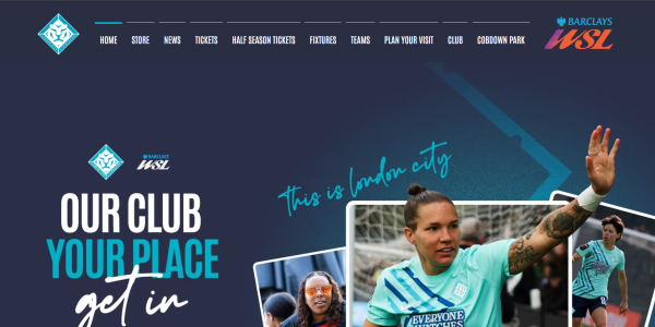
This website takes a bold and modern approach to football branding. The design is confident and people focused, reflecting the club’s identity and values.
Clear navigation, strong typography and striking visuals work together to create a highly engaging experience. The website also performs well for mobile users, which is essential for fans engaging on match days.
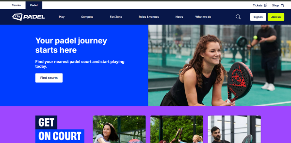
LTA Padel’s website shows how emerging sports can establish credibility quickly through strong digital foundations. The design is clean, energetic and easy to navigate, helping users understand the sport and find ways to get involved.
The website balances education, participation and governance content effectively, making it accessible to both new players and established clubs.
England Rugby’s website is a robust, high traffic platform that delivers clarity at scale. The design is professional and authoritative while still allowing room for storytelling and fan engagement.
Key information such as fixtures, tickets and pathways is easy to access, supported by strong visual content and a consistent brand system.
England Hockey’s website focuses on community and participation. The platform supports clubs, players, coaches and volunteers with structured content and clear signposting.
The design is friendly and approachable while remaining professional. This is a strong example of how national sports organisations can support grassroots growth through digital.
British Swimming’s website balances performance sport with participation and education. The platform supports athletes, parents and clubs with clearly defined user journeys.
The design is calm and confident, with a focus on accessibility and clarity. Content is easy to navigate, and the site performs well across devices.
AllTrails is a great example of a digital first outdoor sports platform. The website and app are built around usability, data and community driven content.
The design is clean and functional, allowing users to search, filter and plan activities with ease. Strong performance and intuitive UX make this a benchmark for outdoor activity platforms.
What these websites do well
Across all ten websites, there are clear patterns that define best practice in 2026. Strong branding that reflects the sport’s identity. Fast and reliable performance. Mobile first design. Clear user journeys. Content structured around real user needs.
Most importantly, the design and development work together. A visually impressive website without solid technical foundations will not perform, rank or convert.
How Smart Web Agency supports sports organisations
At Smart Web Agency, we specialise in designing and developing websites for sports organisations, clubs and governing bodies across the UK and internationally.
Our team delivers secure, high performance and easy to manage platforms that support growth, engagement and long term sustainability. We work across WordPress, Laravel, headless CMS, Webflow and custom platforms depending on the needs of the organisation. From national governing bodies to clubs and event platforms, we focus on user experience, accessibility, SEO and performance from day one.
If you are planning a new outdoor sports website or looking to modernise an existing platform, we would be happy to share insight and examples from our work.
Get in touch with Smart Web Agency to discuss how we can help deliver a future ready sports website that performs as well as it looks.
Finding the best web agency in the UK can feel overwhelming. With thousands of agencies offering web design, development, e-commerce, SEO and branding, choosing the right partner is crucial. To help, we’ve curated a list of top agencies by city, selected through Google organic rankings and our own research.
This guide highlights some of the top web agencies in the UK, based on:
Google organic rankings
Experience & proven track record
Range and quality of services
Technical expertise
Portfolio strength
Industry reputation and reviews
Below is a curated list of agencies across major UK cities, including London, Birmingham, Manchester, Glasgow, Leeds, Liverpool, Edinburgh, Bristol, Newcastle and Kent.
1. Kent – Smart Web Agency
Smart Web Agency Ashford (Kent)
Smart Web Agency isn’t just a website design studio; it’s a multi-disciplinary digital team that brings together designers, developers, software engineers and strategists to build websites and systems that move businesses forward. With 15+ years of experience and clients across the UK, Europe and the Middle East, the agency is known for delivering work that is technically strong, creatively polished and commercially effective.
What makes Smart Web different
High-quality website design & development on WordPress, Webflow, Shopify, Joomla, Drupal and bespoke platforms
Custom software and CRM development for organisations that have outgrown off-the-shelf tools
Stripe Integration Experts
Advanced AI integrations and automation workflows
Membership, subscription and e-commerce systems designed for scalability
Hosting, maintenance, performance optimisation and long-term technical support
A strong ethical stance supporting charities, education providers and positive-impact organisations
Smart Web Agency works with start-ups, SMEs, nonprofits, education providers and large operations teams, offering a powerful blend of creativity, engineering and strategic thinking.
Founded in 2006, ALT Agency is known for performance-driven web design. Their work focuses on measurable growth, combining conversion-driven UX, strong development foundations and ongoing optimisation.
Why they stand out:
Web design, WordPress, eCommerce and custom PHP
Conversion rate optimisation (CRO)
SEO, PPC and digital marketing
Strong portfolio and solid reputation
Ideal for scaling businesses that need both design and performance
MadeByShape is widely recognised for clean, design-led websites and deep technical expertise. As a verified Craft CMS and Craft Commerce partner, they specialise in fully bespoke development for clients who need advanced flexibility.
Why they stand out:
Custom builds on Craft CMS • High-end portfolio including NHS, L’Occitane and BlackBerry • Quality-over-quantity studio ethos • Perfect for brands wanting premium design and performance
With over two decades in the industry, Infinite Eye is a trusted Scottish digital agency offering design, development and managed hosting. They support businesses across the UK and maintain long-term client relationships.
Splitpixel has been delivering accessible, inclusive and user-focused web experiences since 2008. Their team combines WordPress development with brand strategy and digital marketing.
Why they stand out:
Accessibility-first WordPress development
SEO, PPC, CRM integrations and content support
Strong experience working with arts, culture and charities
Ideal for organisations needing inclusive and human-centred design
For over 20 years, DCP has been delivering high-quality websites with an all-in-one service model. Their team includes developers, graphic designers, copywriters and marketing specialists, allowing them to handle everything from custom WordPress builds to full branding packages.
Burgh Web Designer focuses on practical, modern and conversion-driven WordPress sites. Their experience includes e-commerce, booking systems and small business websites.
Grizzly is known for bold creative design and strong digital marketing capability. Their combined approach helps clients grow their online presence systematically not just visually.
Why they stand out:
Strong design and branding capability
SEO and online marketing built into their process
High client satisfaction and Google reviews
Excellent option for businesses wanting full creative + technical support
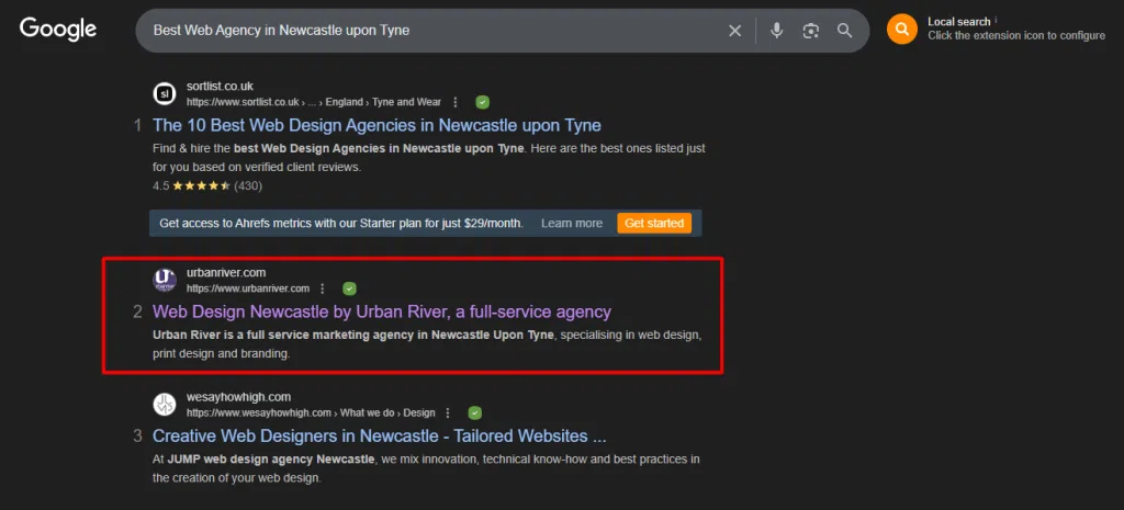
Urban River is a full-service agency with 20+ years of experience delivering branding, web design and marketing campaigns for both public and private sector organisations.
Why they stand out:
Extensive track record
Strong experience in public sector, charities and education
Bespoke website builds and eCommerce
Ideal for organisations needing long-term digital partnerships
Candy Marketing is a younger, boutique agency that offers high-quality design, UX and development for brochure websites and e-commerce. They combine a visual-first approach with marketing expertise.
Why they stand out:
Bespoke website design and eCommerce builds
Strong UX/UI expertise
Personalised service and small-agency agility
Ideal for creative brands and digital-first businesses
How We Selected These Agencies
To provide a meaningful, trustworthy resource, agencies were evaluated on:
Experience & longevity
Portfolio quality and client diversity
Technical skills across modern platforms
Reviews, public reputation and industry presence
Ability to deliver end-to-end solutions (design → development → support)
This adds transparency and strengthens SEO credibility.
Comparison Table – Best Web Agencies in the UK
Agency
Location
Strengths
Ideal Clients
DCP Web Designers
London
WordPress, marketing, branding
SMEs & local businesses
ALT Agency
Birmingham
Conversion-led design, SEO
Growth-focused companies
MadeByShape
Manchester
Craft CMS, premium design
Brands needing bespoke builds
Infinite Eye
Glasgow
UX + hosting + long-term support
Public sector & SMEs
Splitpixel
Leeds
Accessibility, WordPress, CRM
Arts, culture, non-profits
Candy Marketing
Liverpool
Creative design + UX
E-commerce & creative brands
Burgh Web Designer
Edinburgh
WordPress specialists
Small to medium businesses
We Are Grizzly
Bristol
Branding + SEO + websites
Creative businesses
Urban River
Newcastle
Full-service agency
Public sector & charities
Smart Web Agency
Ashford (Kent)
Websites, software, AI, automation
SMEs → Enterprise
Final Thoughts
Choosing the right digital partner is one of the most important decisions a business can make. The agencies listed above represent some of the best web agencies in the UK, each offering a unique blend of creativity, engineering, marketing and long-term support.
If you’re exploring website design, development, software engineering or digital transformation, Smart Web Agency offers end-to-end solutions designed to help businesses grow, automate and scale with confidence.
Disclaimer: This list is independently curated for informational purposes only. No agency mentioned in this article has paid for inclusion, sponsorship or placement. Our goal is simply to help users discover reputable web partners across the UK. Smart Web Agency accepts no responsibility or liability for any loss, damage, or negative outcome you may experience as a result of engaging with any third-party agency listed in this article.
Volusion in basically a well-known brand in the constantly growing world of e-commerce platforms. Since its launch in 1999, it has aided thousands of retailers in creating and running their internet businesses. It has several free templates as well as the option to choose premium one too. Platforms like Shopify, BigCommerce, and Wix gaining centre stage as the e-commerce industry continues to change, many companies are wondering if Volusion will still be worthwhile in 2025.
To help you decide if Volusion is the best option for your online business, This article explores its features, advantages, and disadvantages.
What Is Volusion?
The cloud-based e-commerce platform Volusion was created to assist small and medium-sized enterprises in creating online stores. It provides capabilities for processing payments, managing inventory, building product pages, evaluating store performance, and more.
In contrast to open-source platforms such as WooCommerce or Magento, Volusion offers a comprehensive, hosted solution, which implies that it manages your website hosting and security on your behalf.
Volusion API is also available which provides access to the Volusion database, allowing you to access data through queries.
Pros of Volusion
All-in-One Platform: Inventory, orders, payments, and analytics in one place.
No Transaction Fees: You keep more of your revenue.
Built-in SEO Tools: Helps improve your site’s visibility.
Mobile-Responsive Themes: Clean designs for modern shoppers.
In-House Payments: Easy setup for credit card processing.
Cons of Volusion
Outdated Interface: The backend feels clunky compared to modern competitors.
Limited Customisation: Advanced design changes often require coding.
Weak App Marketplace: Fewer integrations than platforms like Shopify.
No Built-in Blog: Hurts SEO and content marketing potential.
Uncertain Future: Past bankruptcy raises concerns about long-term viability.
Final Thoughts
In 2025, Volusion may not be the most fashionable e-commerce platform available, yet it continues to provide a reliable foundation for specific categories of online businesses, especially those that prioritise simplicity and integrated features. Nevertheless, as user experience expectations, design adaptability, and third-party integrations increase, numerous merchants might discover greater value in platforms such as Shopify, BigCommerce, or even Wix.
Prior to reaching a decision, utilise Volusion’s complimentary trial, examine its administrative interface, and directly compare it with other leading platforms according to your specific business requirements.
Building Modern Websites with Statamic, TailwindCSS, and AlpineJS
In today’s fast-paced web development landscape, choosing the right technology stack is crucial for creating performant, maintainable, and visually appealing websites. Recently, we implemented a complete Statamic CMS solution integrated with TailwindCSS for styling and AlpineJS for interactive functionality. This powerful combination provides developers with a flat-file CMS, utility-first CSS framework, and lightweight JavaScript framework that work seamlessly together.
Route::statamic(‘/news’, ‘news.index’, [ ‘title’ => ‘FC Barcelona News’ ]);
7. Dynamic Content Templates with Antlers
We created dynamic templates utilizing Statamic’s Antlers templating engine:
<!– resources/views/news/index.antlers.html –> <divclass=”max-w-6xl mx-auto px-6 py-12″> <headerclass=”mb-12″> <h1class=”text-4xl font-bold text-gray-900 dark:text-white mb-4″>FC Barcelona News</h1> <pclass=”text-gray-600 dark:text-gray-400 text-lg”> Latest news, transfer updates, and match reports from Camp Nou </p> </header>
Problem: Setting up clean URLs for different content types.
Solution: Configured collection routing and custom routes:
# Collection routing route: /news/{slug}
# Custom routes in web.php Route::statamic(‘/news’, ‘news.index’);
Challenge 3: Styling Consistency
Problem: Maintaining consistent design across different templates.
Solution: Created reusable TailwindCSS component classes and consistent spacing patterns.
Performance Metrics and Results
Before Implementation
Page Load Time: N/A (new project)
Mobile Responsiveness: N/A
SEO Optimization: N/A
After Implementation
Lighthouse Performance Score: 95+
Mobile-First Design: Fully responsive across all breakpoints
SEO-Friendly URLs: Clean, semantic URL structure
Development Speed: 300% faster with utility-first CSS approach
Ongoing Maintenance and Future Enhancements
Current Maintenance Tasks
Regular security updates for Statamic core and dependencies
Content backup strategies using Git version control
Performance monitoring with built-in Laravel tools
SEO optimization with meta tags and structured data
Planned Future Enhancements
Additional collections for players, matches, and statistics
Advanced search functionality using Statamic’s search features
User authentication for member areas
API integration for real-time sports data
Multilingual support for international audiences
Conclusion: Modern Web Development with Statamic Stack
The combination of Statamic CMS, TailwindCSS, and AlpineJS provides an exceptional foundation for modern web development. This stack offers:
Developer productivity through utility-first CSS and reactive JavaScript
Content flexibility with flat-file architecture
Performance optimization through modern build tools
Maintainability with component-based architecture
Scalability for growing content needs
The implementation demonstrates how these technologies work together to create fast, responsive, and maintainable websites that provide excellent user experiences across all devices.
Whether you’re building a sports fan site, corporate website, or personal blog, this technology stack provides the tools and flexibility needed for success in today’s competitive web landscape.
Technical Specifications
Framework Versions:
Statamic CMS: 5.x
Laravel: 12.x
TailwindCSS: 4.0.6
AlpineJS: 3.15.0
Vite: 7.0.4
PHP: 8.2+
Browser Support:
Chrome 90+
Firefox 88+
Safari 14+
Edge 90+
Performance Targets:
Lighthouse Performance: 90+
First Contentful Paint: <1.5s
Largest Contentful Paint: <2.5s
Cumulative Layout Shift: <0.1
This implementation showcases the power of modern web development tools working in harmony to create exceptional digital experiences. The result is a fast, maintainable, and visually appealing website that serves as an excellent foundation for any content-driven project.
FAQs:
1. How do I install and configure TailwindCSS with Statamic?
You’ll need to integrate Tailwind through Vite. After running npm install tailwindcss @tailwindcss/typography, configure vite.config.js to include Tailwind and Laravel’s Vite plugin. Finally, set up your tailwind.config.js file to purge unused styles and extend your design system.
2. Can AlpineJS be used directly in Statamic templates?
Yes. You can import AlpineJS into your main JavaScript entry file (resources/js/site.js) or add it via CDN. Once loaded, Alpine works seamlessly inside Antlers templates, making it perfect for interactive navigation menus, toggles, and modals without heavy JavaScript frameworks.
3. How do I structure content and routing in Statamic?
Content is organised in collections (e.g., news.yaml) with routes defined like /news/{slug}. Templates are built with Antlers, where you can loop through collections and display entries. Routing is managed in routes/web.php with the Route::statamic() helper, allowing both static and dynamic pages.
Ever stared at a stunning Figma design, pixel-perfect and brimming with creative energy, and then felt that familiar pang of dread? The one that whispers, “How on earth do I turn this beautiful vision into a live, breathing website?” You’re not alone. This chasm between a designer’s masterpiece and a developer’s functional reality is a tale as old as web design itself. But what if I told you that bridging this gap, especially when it comes to platforms like WordPress, isn’t just possible, but can be an incredibly rewarding journey?
Why Figma? The Power of Design
Before we dive into the nitty-gritty of conversion, let’s take a moment to appreciate the star of our show: Figma. For many of us in the design and development world, Figma has become more than just a tool; it’s a collaborative ecosystem. Its web-based nature means real-time collaboration is a breeze, allowing designers, stakeholders, and even developers to jump into a project simultaneously, leaving comments, making tweaks, and generally fostering a more unified workflow. This isn’t just about convenience; it’s about efficiency and reducing those frustrating feedback loops.
Figma’s component-based architecture is another game-changer. Imagine designing a button once, defining its states (hover, active, disabled), and then reusing it across hundreds of screens. If you need to change its color or font size, you do it once, and it updates everywhere. This level of consistency and speed is invaluable, especially for larger projects. It helps maintain a cohesive brand identity and significantly accelerates the design process. The ability to create intricate prototypes directly within Figma also means designers can simulate user flows and interactions with remarkable accuracy, providing a clearer vision of the final product long before a single line of code is written.
Ultimately, Figma empowers designers to chase that ‘pixel-perfect’ dream. It provides the tools to craft visually stunning, highly functional interfaces with incredible precision. But herein lies the rub: the more intricate and polished a design becomes in Figma, the more challenging it can feel to translate that exact vision into a live website. This brings us to our next point: the conversion conundrum.
The Conversion Conundrum: Challenges and Pitfalls
So, you have your flawless Figma design. Now what? This is where the real fun begins, and by fun, I mean the potential for a whole lot of headaches. The path from Figma to a live website is fraught with challenges, and being aware of them is the first step to overcoming them.
Design Fidelity: This is the big one. You’ve spent hours, maybe even days, perfecting every last detail in Figma. The typography is just right, the spacing is immaculate, and the color palette is a work of art. But then, you start the conversion process, and suddenly, things look…off. Fonts might render differently in the browser, spacing can get wonky, and those beautiful, subtle animations you designed? They might not translate at all. This loss of visual accuracy is a common frustration, and it often stems from the fundamental differences between a design environment like Figma and the dynamic, unpredictable world of web browsers.
Responsiveness: In Figma, you can create what looks like a responsive design. You can use Auto Layout and constraints to simulate how elements should behave on different screen sizes. But this is still a simulation. The reality of CSS media queries, flexbox, and grid can be a different beast altogether. What works perfectly in a controlled Figma environment might break spectacularly on a real device. Ensuring your design is truly responsive across a multitude of screen sizes and devices is a significant challenge, and it requires a deep understanding of both design principles and front-end development.
Interactivity: Figma prototypes can be incredibly sophisticated, but they are still, at their core, a series of static screens linked together. A live website, on the other hand, is a dynamic, interactive experience. Translating the feeling of an interaction from a Figma prototype to a functional web element requires more than just copying and pasting code. It requires a thoughtful approach to user experience, considering things like loading states, error messages, and all the other little details that make a website feel alive and responsive.
Performance: It’s easy to get carried away in Figma, adding high-resolution images, complex vector graphics, and intricate animations. But every element you add has a cost in terms of performance. A design that looks beautiful in Figma can result in a slow, bloated website if not optimized correctly. This is where the expertise of a developer is crucial, as they can make informed decisions about things like image compression, code minification, and caching to ensure your website is not only beautiful but also fast and efficient.
Communication Gaps: The classic designer-developer handoff. The designer throws a Figma file over the virtual wall, and the developer is left to decipher it. This often leads to misunderstandings, frustration, and a final product that doesn’t quite match the original vision. The key to avoiding this is to foster a collaborative environment where designers and developers work together from the very beginning, communicating openly and frequently throughout the entire process.
Technical Debt: In the rush to get a website live, it’s tempting to take shortcuts. Maybe you use a plugin that almost does what you want, or you write some quick and dirty code to fix a layout issue. While these solutions might work in the short term, they can lead to a mountain of technical debt down the road, making your website difficult to maintain, update, and scale.
These challenges might seem daunting, but don’t despair! With the right approach, they are all surmountable. In the next section, we’ll explore the different methods for converting your Figma designs to WordPress, each with its own set of pros and cons.
Bridging the Gap: Methods for Figma to WordPress Conversion
Now for the main event: how do we actually get that beautiful Figma design into a functional WordPress website? There are several paths you can take, each with its own unique set of advantages and disadvantages. The right choice for you will depend on your project’s complexity, your budget, your timeline, and your team’s skillset.
A. Manual Coding (The Developer’s Craft)
This is the traditional, time-honoured approach. It involves a skilled developer taking your Figma design and manually writing the HTML, CSS, and JavaScript code to bring it to life. This code is then integrated into a custom WordPress theme, giving you a website that is a true one-of-a-kind creation.
The Process: The developer will start by exporting all the necessary assets from your Figma file, such as images, icons, and fonts. They will then meticulously write the HTML structure, style it with CSS to match your design pixel for pixel and add any necessary JavaScript for interactivity. Finally, they will integrate this front-end code into a WordPress theme, making sure to leverage WordPress’s powerful features like custom post types, advanced custom fields, and the block editor.
Pros: The biggest advantage of manual coding is the level of control it provides. You are not limited by the constraints of a pre-built theme or page builder. You can create a truly custom design with unique interactions and animations. The resulting code is also typically much cleaner and more optimized, leading to a faster, more performant website. This approach also allows for greater flexibility and scalability in the long run.
Cons: The downside of manual coding is that it is the most time-consuming and expensive option. It requires the expertise of a skilled developer, which can be a significant investment. It also means that any future design changes will likely require a developer’s intervention.
Best for: Highly custom designs, complex web applications, and websites where performance is a top priority.
B. Using Page Builders (e.g., Elementor, Divi)
Page builders have revolutionized the WordPress world, allowing users to create beautiful, professional-looking websites without writing a single line of code. These tools provide a visual, drag-and-drop interface that makes it easy to build complex layouts and add a wide range of features to your website.
The Process: With a page builder, you essentially rebuild your Figma design within the WordPress environment. Many page builders now offer Figma integration plugins that can help streamline this process, allowing you to import your design assets and styles directly into the page builder. You then use the page builder’s visual interface to arrange your content, customize your design, and add any necessary functionality.
Pros: The main advantage of page builders is their speed and ease of use. You can create a fully functional website in a fraction of the time it would take to code it manually. They are also much more budget-friendly, as you don’t need to hire a developer. The visual editing interface also makes it easy for non-technical users to make changes and updates to their website.
Cons: The trade-off for this convenience is a loss of control and flexibility. You are limited by the features and design options of the page builder you choose. The code generated by page builders can also be bloated and inefficient, which can negatively impact your website’s performance. There is also a learning curve involved in mastering a page builder, and you may find yourself locked into a particular ecosystem.
Best for: Small to medium-sized websites, designers who don’t have coding skills, and rapid prototyping.
C. Figma to WordPress Plugins/Tools (e.g., UiChemy, Yotako, Fignel)
A new generation of tools has emerged that promise to automate the Figma to WordPress conversion process. These plugins and tools analyze your Figma design and automatically generate the corresponding WordPress theme or block editor code.
The Process: The process is typically very straightforward. You install a plugin in Figma, select the design you want to convert, and the tool does the rest. The output can vary from a complete WordPress theme to individual blocks that you can use in the WordPress editor.
Pros: The main benefit of these tools is their speed. You can convert a Figma design to a WordPress website in a matter of minutes, which is a huge time-saver. They also significantly reduce the amount of manual effort required, freeing you up to focus on other aspects of your project.
Cons: The quality of the generated code can be a mixed bag. While some tools are getting better, many still produce code that is messy, inefficient, and difficult to customize. You are also limited by the features and capabilities of the tool, and you may find that you need to do a lot of manual tweaking to get the desired result. There is also the risk of vendor lock-in, as you may be dependent on the tool for future updates and maintenance.
Best for: Simple designs, quick proof-of-concepts, and situations where speed is the top priority.
Best Practices for a Smooth Transition
Regardless of the method you choose, there are several best practices you can follow to ensure a smoother, more successful Figma to WordPress conversion. It all starts with a little preparation and a lot of communication.
A. Figma Side Preparation
Before you even think about converting your design, take some time to clean up and organize your Figma file. This will make the handoff process much smoother, whether you’re handing it off to a developer or a conversion tool.
Organize Your Layers and Components: A clean and well-organized Figma file is a developer’s best friend. Use a consistent naming convention for your layers and components and group them logically. This will make it much easier for the developer to understand your design and translate it into code.
Use Styles and Variables: Figma’s styles and variables are incredibly powerful tools for maintaining consistency in your design. Use them to define your color palette, typography, and spacing. This will not only make your design more consistent but also make it much easier to make global changes down the road.
Design with Responsiveness in Mind: Don’t just create a static design for a single screen size. Use Figma’s Auto Layout and constraints to create a responsive design that adapts to different screen sizes. This will give your developer a much clearer understanding of how your design should behave on different devices.
Provide a Clear Handoff: Don’t just throw your Figma file over the wall. Provide your developer with a clear and comprehensive handoff package. This should include a style guide, exported assets, and detailed notes on any complex interactions or animations.
B. WordPress Side Implementation
Once you’re ready to start building your website in WordPress, there are a few things you can do to set yourself up for success.
Choose the Right Method: As we discussed earlier, there are several different methods for converting your Figma design to WordPress. Choose the one that best aligns with your project’s complexity, your budget, and your team’s skillset.
Start with a Lightweight Theme: Don’t start with a bloated, feature-heavy theme. Choose a lightweight, flexible theme like Generate Press or Astra. This will give you a solid foundation to build upon, without all the unnecessary bells and whistles.
Use a Child Theme: This is a golden rule of WordPress development. Always use a child theme for your customizations. This will ensure that your changes are not overwritten when you update your parent theme.
Optimize for Performance: Don’t wait until the end of your project to think about performance. Optimize your images, use a caching plugin, and minimize the number of plugins you use. A fast and performant website is crucial for a good user experience.
Test, Test, Test: Before you launch your website, make sure to test it thoroughly. Test it on different browsers, different devices, and different screen sizes. Check for any accessibility issues, and make sure that all of your forms and interactive elements are working correctly.
A Human Touch: Beyond the Code
While tools and techniques are essential, the most successful Figma to WordPress conversions often come down to something far less technical: human connection and understanding. As a full-stack development consultant with a passion for content, I’ve seen firsthand how crucial this ‘human touch’ is.
Collaboration is Key: This isn’t just a buzzword; it’s the bedrock of a successful project. Designers and developers often speak different languages, focusing on different aspects of a project. Designers dream in pixels and user flows, while developers think in functions and databases. The magic happens when these two worlds collide constructively. Regular check-ins, shared understanding of project goals, and a willingness to compromise can turn potential conflicts into creative solutions. It’s about building a bridge of empathy, where each side appreciates the challenges and expertise of the other.
Embrace Iteration: The journey from design to a live website is rarely a straight line. There will be bumps, detours, and moments where you realize a brilliant Figma concept just doesn’t translate perfectly to the web without significant performance compromises. This is where iteration comes in. Instead of viewing these as failures, see them as opportunities to refine, adapt, and improve. A flexible mindset, both from the designer and the developer, allows for adjustments that ultimately lead to a better end product.
Understanding Limitations: Sometimes, a design might be breathtakingly beautiful in Figma, but incredibly complex, slow, or even impossible to implement efficiently on a web platform, especially within budget or timeline constraints. A human-centric approach means having honest conversations about these limitations early on. It’s about finding creative workarounds, simplifying elements without sacrificing the core vision, and making informed decisions that balance aesthetics with practicality and performance. The goal isn’t just to replicate a design; it’s to create an exceptional user experience that performs well.
The User Experience Above All: Ultimately, our goal isn’t just pixel perfection or clean code; it’s to create a website that serves its users effectively. A human-like blog post about this process wouldn’t be complete without emphasizing that the end-user’s experience should always be the guiding star. Is the site fast? Is it easy to navigate? Does it convey the intended message? Sometimes, a slight deviation from the Figma design might actually improve the user experience on the live site. Keeping this perspective ensures that our technical efforts are always aligned with the ultimate purpose of the website.
Conclusion: Your Figma Design, Live and Thriving
The journey from a brilliant Figma design to a fully functional WordPress website can feel like traversing a vast canyon. But as we’ve explored, it’s a journey filled with exciting possibilities, provided you approach it with the right mindset and tools. Whether you choose the meticulous craft of manual coding, the visual power of page builders, or the rapid automation of specialized plugins, success hinges on understanding the nuances of each method and, crucially, embracing a collaborative, human-centered approach.
It’s about more than just converting files; it’s about translating a vision. It’s about maintaining design fidelity while ensuring responsiveness, optimizing for performance, and fostering seamless communication between designers and developers. When these elements align, the result isn’t just a website; it’s a thriving digital experience that truly reflects the original design intent and serves its users beautifully. So go forth, bridge that gap, and watch your Figma designs come alive on the web!